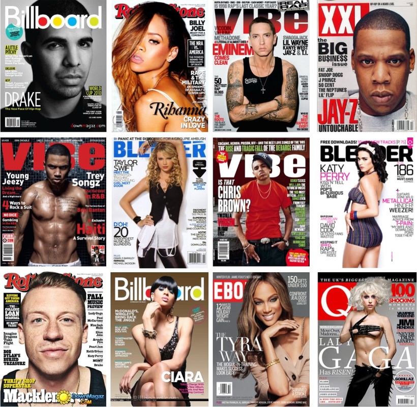
Planning my magazines before I starts to construct and photograph was a really important thing to do. I decided to have a look at professional magazine pages and imagined and thought about how my magazine would look with the features in it. This helped me to decide how I wanted my magazine to turn out and how I want my models to look, as well as other conventions.
Looking at these magazines also gave me a slight inspiration of how well structured and designed my magazine should be.
Looking at these magazines also gave me a slight inspiration of how well structured and designed my magazine should be.
Contact Sheets

Here are some photographs I shot for my front cover. I selected the third on because it makes my model (Milena Aleksandrova) look powerful. Also, I wanted her hair to be blown back a little bit to gather the male gaze but not too much.
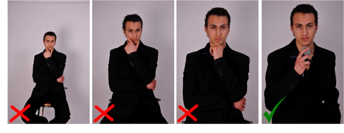
These are the photographs I took for my contents page. I wanted my model (Ali Roumieh) to challenge stereotypical views of Hip Hop artists and make him look powerful and formal. I wasn't too sure on how his hands should be positioned so I tried a variety of poses. I selected the fourth one because it justifies the fact that he is a singer and his face looks like he is a singer too.

Above are the photographs I shot for my double page spread. I wanted to use a brick wall as I wanted my background to look different to my other pages. Also, a brick wall symbolises the building up of my model (Sherry Khan) as he is building his way up through life. He is wearing a hood to make him look like thug.
 RSS Feed
