Conventions are features in a magazine that are used to make the magazine appealing to its audience. For example, if a magazine is aimed at young girls, the colours would be very feminine and the fonts would be rather soft and smooth. Here are some conventions that are likely to be found in a magazine:
- Buzz words
- Typography
- Masthead
- Colour codes
- Puff
- Banners
- Features
- Fonts
- Social network
- Main image
- Barcode
These are some conventions you would be likely to find in a magazine. However, just like in other markets such as clothing and electronics, there are niche audiences. Conventions could be challenged when trying to make your magazine appealing to niche audiences as niche products fill in gaps within the market. Also, by using these conventions the magazine produced would be common to other magazines in the market. This is why most magazines look similar to other competitor magazines of its genre. This could be the reason why magazines are going in decline, as well as the rise in technology.

Here is an example of a magazine that follows some conventions. First of all, there is clearly a colour code. As the colour codes are white pink and a bit of denim blue, it is understood that this magazine is aimed at females. Also, as the font is quite bold, blocky and quite ‘grown up’ it reveals that it is aimed at an adult audience.
Just by using two conventions alone it is made clear of who the target audience is. There is also a good use of typography. For instance, buzz words and phrases such as ‘cool’ and ‘great style at any age’ are bigger than other words to get the reader’s attention, these things would interest the audience and make the want to read into. You can see these words have a purpose. For example the phrase ‘great style at any age’ is something women would want to hear as some women get insecure about their looks when they reach a certain age.
Mise en scene is another great factor in this magazine. The main feature in this magazine is wearing a necklace around her neck that has a tiger skin print on it. This would make the woman look feisty, wild and sexy. In addition, the model is standing while her hair is being blown and her body is positioned in an attractive manner.
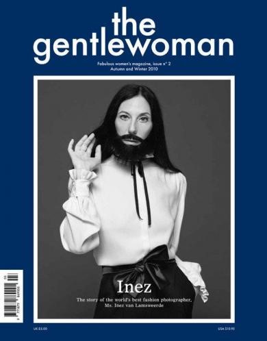
This is a magazine that is aimed at a niche audience. This is because as you would notice the conventions have been challenged in this magazine. The woman has a beard and looks rather masculine, which challenges dominant ideology. Furthermore, the colour code is rather masculine too. The typography of the masthead looks like it is aimed at women. There is also a barcode which is another common convention. There are also other conventions missing; buzz words, banners and puff. On the other hand, there are still some convention rules being followed. For example, the positioning of the woman to make her look attractive and the airbrushing and make up on her face to create hypereality.
The conventions have been challenged with a purpose, and that is to make the magazine look appealing to a niche audience.
By using just these two examples, it is easy to see how there is a variety of magazine styles, each that suits its own target audience. This is where conventions comes into play. As a result, when I started to plan my magazine pages, I decided I want to follow the rules of convention in order to grasp the widest audience I could, rather than challenging conventions and aiming at a smaller niche audience. However, I also acknowledged the fact that if I followed conventions I would have to make my magazine stand out from its competitors.

Here is a part of my magazine front cover. I have used a variety of conventions. For example, I have used puff and put a purple bubble around it to make it stand out from the rest of the features. I used a puff to make the audience feel like they can win something and reward themselves by consuming this magazine. I have also got a main feature, who is wearing a dress.
This would gather the male gaze as she is wearing a dress and her hair is getting blown back. It is noticeable that there is a colour code and the colours are rather feminine. I used this style of colour code to make my magazine appealing to my target audience, teenage girls from 15 to 19.
The colours and font codifies that my magazine is aimed at that audience.
Additionally, on the bottom right hand corner I have included two social network logos and the links to follow my magazine page on it. This is to include a multi-platform approach, as well as creating synergy that social networks are helping me promote my product. By using social networks, not only does it help my magazine reach out to a wide audience but it also helps me to make improvements by people leaving their comments on my page on their experience. As well as that, using social networks to promote my product would also encourage exchange. I have also avoided airbrushing my models, this is to avoid creating dominant ideology and by not having hyper real images.
 RSS Feed
